
Intro
Creating a harmonious and visually appealing space involves careful consideration of various elements, and color plays a vital role in setting the tone and atmosphere. In this article, we will explore the art of selecting colors, understanding their qualities, and crafting color palettes that enhance the overall aesthetic and mood of your rooms. Whether you're embarking on a home renovation or simply looking to refresh your living space, this guide will provide you with valuable insights and practical tips to help you make informed decisions when it comes to color and design.
COLOR & COLOR SYSTEMS

Color Systems
Colors can be interpreted, combined and labeled in different design systems, and before we go over 30 general colors and their oval meaning, value and emotional response they tend to trigger, let’s quickly go over 13 ways that we can interpret color, of which the first ones are the most common.
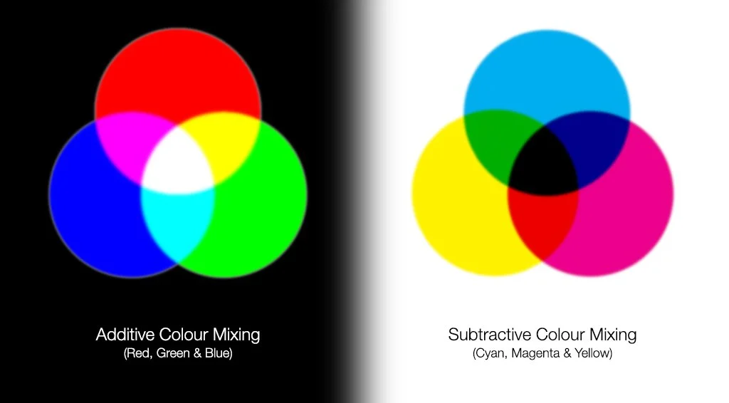
RGB (Red, Green, Blue): This system is based on the three primary colors of light. By adjusting the intensity of each color, you can create a wide range of colors.
CMYK (Cyan, Magenta, Yellow, Black): This system is commonly used in printing. Cyan, magenta, and yellow are mixed to create different colors, while black is used for shading and depth.
HSL (Hue, Saturation, Lightness): It describes color based on hue, saturation, and lightness. It is useful for selecting colors with a specific tone and intensity.
HSV (Hue, Saturation, Value): This system is similar to HSL, but the third dimension is "value" instead of "lightness." It is often used in computer graphics and image processing.
HEX Color Codes: This is a six-digit code used to define colors on the web. Each two digits represent the intensity of red, green, and blue.
Pantone Color System: Pantone is a standardized color system widely used in the graphic industry. It offers a wide range of colors with unique identification numbers.
RAL Color System: RAL is a European color standard commonly used for paint and coating applications. It has an extensive palette of colors with specific codes.
NCS (Natural Color System): This system is based on the human eye's perception of color. It uses notations to describe color attributes such as hue, lightness, and saturation.
RGBW (Red, Green, Blue, White): This system adds an additional white component to RGB. It is often used in LED lighting systems to produce a wider range of colors.
YUV (Luminance, Chrominance): This color model is frequently used in analog television broadcasting. It separates the luminance (brightness) from the color information (chrominance).
Lab Color System (CIELAB): This system quantifies color based on human perception. It describes color space in terms of lightness, red-green, and yellow-blue axes.
YCbCr: This color model is widely used in digital image and video processing. It encodes color information into three components: luminance (Y) and two chrominance components (Cb and Cr)..
sRGB: Standard RGB (sRGB) is the default color space for most digital displays and the web. It ensures consistent color representation across different devices.
It’s also important to understand, that in additive systems, where primary colors of light are combines, we gain a lighter color, and in subtractive systems, we gain a darker color when 2 colors are combined; as can be seen in the following images:
ColorS
Although different philosophical streams, eras, cultures and stages of ego development assign different meanings to the different colors, we can assign very fundamental meanings, values and emotional frequencies to the different colors of the full spectrum of color.
Red: Meaning - Passion, energy; Value - Boldness; Emotion - Excitement, love.
Orange: Meaning - Creativity, enthusiasm; Value - Warmth; Emotion - Joy, optimism.
Yellow: Meaning - Happiness, positivity; Value - Radiance; Emotion - Cheerfulness, optimism.
Green: Meaning - Growth, harmony; Value - Balance; Emotion - Calmness, rejuvenation.
Blue: Meaning - Trust, tranquility; Value - Stability; Emotion - Serenity, peace.
Indigo: Meaning - Intuition, spirituality; Value - Depth; Emotion - Wisdom, introspection.
Violet: Meaning - Imagination, spirituality; Value - Elegance; Emotion - Inspiration, mystery.
Pink: Meaning - Love, compassion; Value - Gentleness; Emotion - Affection, tenderness.
Magenta: Meaning - Creativity, individuality; Value - Vibrancy; Emotion - Uniqueness, passion.
Purple: Meaning - Royalty, power; Value - Luxury; Emotion - Nobility, ambition.
Turquoise: Meaning - Healing, tranquility; Value - Clarity; Emotion - Serenity, balance.
Teal: Meaning - Stability, communication; Value - Reliability; Emotion - Calmness, trust.
Cyan: Meaning - Peace, serenity; Value - Coolness; Emotion - Tranquility, clarity.
Aqua: Meaning - Refreshment, purity; Value - Rejuvenation; Emotion - Cleansing, harmony.
Lime: Meaning - Vitality, energy; Value - Zest; Emotion - Liveliness, freshness.
Chartreuse: Meaning - Growth, renewal; Value - Vibrancy; Emotion - Enthusiasm, rejuvenation.
Gold: Meaning - Abundance, wealth; Value - Opulence; Emotion - Success, prestige.
Silver: Meaning - Modernity, sophistication; Value - Elegance; Emotion - Gracefulness, sleekness.
Bronze: Meaning - Strength, resilience; Value - Warmth; Emotion - Determination, endurance.
Brown: Meaning - Stability, grounding; Value - Earthiness; Emotion - Reliability, comfort.
Gray: Meaning - Neutrality, balance; Value - Versatility; Emotion - Serenity, timelessness.
White: Meaning - Purity, innocence; Value - Simplicity; Emotion - Clarity, peace.
Black: Meaning - Power, mystery; Value - Elegance; Emotion - Sophistication, authority.
Beige: Meaning - Simplicity, warmth; Value - Softness; Emotion - Comfort, neutrality.
Cream: Meaning - Softness, luxury; Value - Subtlety; Emotion - Serenity, gentleness.
Ivory: Meaning - Elegance, purity; Value - Sophistication; Emotion - Refinement, calmness.
Maroon: Meaning - Passion, strength; Value - Intensity; Emotion - Determination, sensuality.
Navy: Meaning - Trust, authority; Value - Depth; Emotion - Confidence, stability.
Olive: Meaning - Harmony, growth; Value - Naturalness; Emotion - Balance, tranquility.
Peach: Meaning - Warmth, gentleness; Value - Softness; Emotion - Kindness, comfort.
Color Palette
Colors, color wheels & different color systems can be combined to create different kinds of palettes. Here are 30 different kinds of color palettes or ways to combine colors on the spectrum that can be considered, chosen or combined for any room, kind or space.

Monochromatic Palette: Choose different shades and tints of a single color for a cohesive and soothing look.
Analogous Colors: Select colors that are next to each other on the color wheel for a harmonious and unified palette.
Complementary Colors: Pair colors that are opposite each other on the color wheel to create a vibrant and balanced contrast.
Triadic Colors: Use three colors that are evenly spaced on the color wheel to create a dynamic and visually appealing palette.
Tetradic Colors: Combine two sets of complementary colors for a rich and diverse color scheme.
Neutral Base: Start with a neutral color palette and add pops of vibrant colors as accents for a balanced and sophisticated look.
Nature-Inspired Palette: Draw inspiration from natural elements and use earthy tones, such as greens, browns, and blues, for a calming and organic feel.
Pastel Palette: Choose soft, muted shades of colors for a delicate and soothing atmosphere.
Bold and Vibrant Palette: Opt for bright and saturated colors for a lively and energetic space.
Cool-Toned Palette: Use colors with blue undertones, such as blues and purples, for a serene and calming ambiance.
Warm-Toned Palette: Select colors with red and yellow undertones, such as oranges and yellows, for a cozy and inviting atmosphere.
Gradient Palette: Create a gradual transition of colors from light to dark or from one hue to another for a seamless and visually pleasing effect.
High-Contrast Palette: Combine colors with a stark contrast, such as black and white or bright yellow and deep purple, for a bold and dramatic look.
Retro Palette: Embrace colors from past eras, such as vibrant oranges and yellows from the '70s or muted pastels from the '50s, for a nostalgic and unique vibe.
Minimalist Palette: Stick to a simple palette of black, white, and one or two accent colors for a clean and modern aesthetic.
Metallic Palette: Incorporate metallic colors like gold, silver, or bronze for a touch of luxury and elegance.
Ombre Palette: Gradually transition colors from light to dark or vice versa within the same hue family for a visually striking effect.
Cultural Palette: Draw inspiration from the colors associated with a specific culture or tradition for a unique and meaningful color scheme.
Coastal Palette: Use a combination of blues, whites, and sandy neutrals to create a serene and beachy atmosphere.
Urban Palette: Embrace grays, blacks, and pops of vibrant colors to reflect the energy and diversity of a bustling cityscape.
Moody Palette: Select deep and rich colors like burgundy, navy, and emerald green for a mysterious and intimate ambiance.
Soft and Subtle Palette: Choose muted and understated colors for a gentle and calming atmosphere.
Whimsical Palette: Play with bright and unexpected color combinations for a fun and playful look.
Seasonal Palette: Take inspiration from the colors associated with different seasons, such as warm oranges and browns for fall or fresh greens and pastels for spring.
Earthy Palette: Incorporate warm and earthy tones like terracotta, olive green, and mustard yellow for a grounded and organic feel.
High-Intensity Palette: Experiment with colors that have a high level of saturation for a bold and energetic vibe.
Tropical Palette: Use vibrant and tropical colors like coral, turquoise, and lime green to evoke a sense of paradise and relaxation.
Vintage Palette: Choose colors reminiscent of past decades, such as soft pinks, mint greens, and mustard yellows, for a nostalgic and vintage-inspired look.
Global-Inspired Palette: Explore colors inspired by different cultures and regions around the world, incorporating vibrant hues and intricate patterns for a diverse and eclectic color scheme.

Conclusion
Designing rooms and selecting colors is an intricate process that requires attention to detail and an understanding of the power of color in influencing our emotions and experiences. By considering the qualities of different colors, exploring their meanings and associations, and carefully curating color palettes, you can create spaces that reflect your personal style, evoke desired moods, and promote a sense of harmony and balance. Remember, the quality of colors and the thoughtful design of color palettes can transform a room into a captivating and inviting haven. So, go ahead, unleash your creativity, and let the colors speak volumes in your living spaces.
NOTE TO SELF
WIT
CONSCIOUSNESS
BEWUSTZIJN
EVERZWIJN
CREATION
VOELEN
VIEREN
LIGHT
LOVE
GOD
RED
AARDES KERN
VOETZOLEN
BALLEN
PASSIE
GELD
HELD
WETEN
ORANJE
EXCITEMENT
FULFILLMENT
VERTROUWEN
MASTERY OF SELF
OPTIMAL BELONGING
GENERATION OF BLISS
GEEL
DE ZON
FAMILIE
LACHEN
PLEZIER
WARMTE
‘WILLEN’
BIJHOREN
ZELFREALISATIE
AKASHIC ETHER
GROEN
ZELF LIEFDE
BEVRIJDING
TIJDLOOS
RUIMTE
BLAUW
ZEE
NORM
VENUS
INDIGO
OCEAAN
VERDRIET
DELUSION
ZUURSTOF
ECHT VERLANGEN
VIOLET
ZIEL
PAARS
EERBIED
EENHEID
KONINKLIJK
MEESTERSCHAP
BRUIN
MENS
HELEN
HEELHEID
GEGROND
ERKENNING
ACCEPTATIE
GOEDKEURING
AFWIJZING
ZWART
A I
DOEN
HATEN
DELEN
AFRIKA
VOELEN
DENKEN
AMERIKA
RESOLUTIE
OBSERVATIE